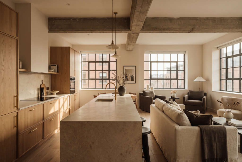
Every mistake here comes from treating a rental like a home, or like a box to fill, rather than a commercial asset that has to earn. Put each decision to a simple test: does it improve the guest experience, the nightly rate, the occupancy or the reviews. If it doesn’t, it doesn’t make the cut.
“Most short-term rentals aren’t let down by budget. They’re let down by decisions that felt sensible in isolation and quietly cost the owner every month afterwards.”
Corin Craig Jackson, Managing Director, Heim Studio
Here are our top seven interior design mistakes people make in short-term rentals.
1.) Designing for a homeowner, not a guest
The instinct is to furnish a rental the way you’d furnish your own home. But a guest arrives tired, doesn’t know where anything is, and judges the whole stay in the first ten minutes. Design for the person walking in with a suitcase, not the one who already knows where the towels are. That means obvious storage and layouts that need no explanation.
2.) Buying the cheapest version of everything
Furnishing to the lowest price point is the most expensive decision you can make. A rental takes years of wear in months, and every early replacement is a cost, a gap in the calendar and a dip in reviews. Spend correctly, not everywhere: put the money into the pieces that take the most contact and the most photographs, and be sensible about the rest.
3.) Ignoring how the space photographs
A guest compares twenty listings in seconds and decides almost entirely on how each space reads in a photo. Flat lighting, cluttered surfaces and furniture pushed against every wall all read as cheap on camera. Consider the shot while you design: layered light, depth, a focal point in each room. The listing photo sets your nightly rate before anyone arrives.
4.) Neglecting the layout in favour of the finishes
Owners fixate on paint and cushions and leave the layout as found. But flow is what a guest actually feels, and a bad one shows up in reviews long before it shows up in a walkthrough.
“Finishes sit on top of a good layout. They can’t rescue a bad one.”
Phoebe Desser, Senior Designer, Heim Studio
5.) Forgetting the practical guest experience
Not enough coat hooks, one plug socket by the bed, no full-length mirror: none of it shows in photos, all of it shows in reviews. Walk the property as a guest would. Where do they drop their bag, charge a phone, hang a wet towel. Fix what you find before a guest finds it for you.
6.) Chasing a trend instead of a positioning
A fully on-trend interior dates as fast as the trend does, and re-fitting every two years is no way to run an asset. Chasing whatever’s currently on Pinterest also tends to produce a space that looks like everyone else’s. Aim for a considered, timeless base with personality layered through the pieces that are cheap to change.
7.) Under-styling the finished space
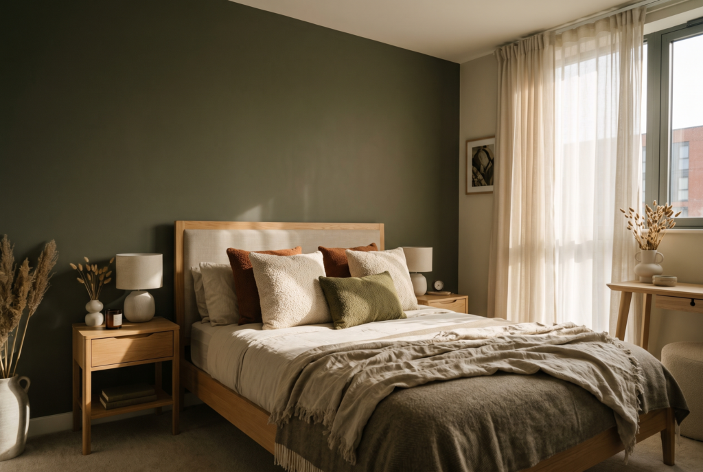
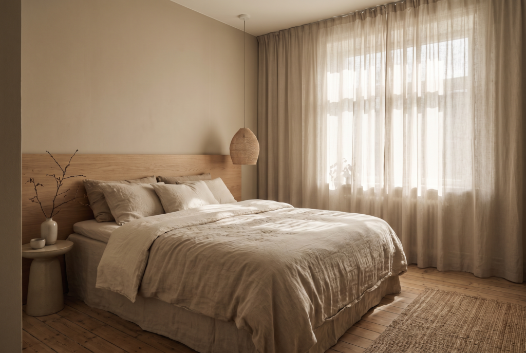
A property that’s furnished but not styled reads as unfinished and photographs as empty. Bare walls and naked surfaces leave a space feeling like a showroom nobody has moved into. Styling, art, texture, a made bed with real layers, is the cheapest lever on the list and the one owners skip most.
None of this is complicated. It’s rarely applied with any real discipline, which is exactly why it’s worth saying plainly. Heim Studio designs short-term rental interiors across Manchester city centre, and every decision we make is put to the same test: does it improve guest experience, nightly rate, occupancy or review quality. Follow @heimstudiomcr or visit staging.heim-studio.co.uk for more, and if you want Heim Studio to design your space by becoming a HeimHost client, contact us today at hello@heimhost.co.uk or visit www.heimhost.co.uk.