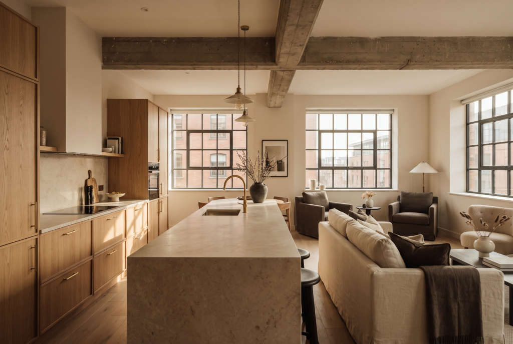
Colour is the first thing a guest feels and the last thing most owners think about. Here’s how to use it deliberately, as a lever for mood, perceived space and rate, rather than a late decision from a paint chart.
The lever most owners choose last
Colour is the first thing a guest feels and the last thing most owners think about. It gets chosen late, from a paint chart, on gut instinct, or worse, defaulted to whatever grey-and-white combination the last five listings used. That’s a mistake, because colour isn’t decoration. It’s the fastest, cheapest lever you have for changing how a space feels, how it photographs, and how much someone will pay to sleep in it. The science here is real but simple. Colour changes mood and perception of value before a guest has consciously registered a single object in the room.
“Colour isn’t decoration. It’s the fastest, cheapest lever you have for changing how a space feels, how it photographs, and how much someone will pay to sleep in it.”
Phoebe Desser, Senior Interior Designer, Heim Studio
1.) Colour sets the emotional tone before anything else
A guest walks in tired, arriving somewhere unfamiliar, and their nervous system reads the room in seconds. Warm tones, terracotta, ochre, deep clay, register as comfort and safety. Cool tones, blues and greens, register as calm and rest. That reaction happens before they’ve noticed the sofa or the art. This is why the palette should follow the job the property does, not your personal taste. A city base for someone here to work wants clarity and calm, so it can lean cooler and cleaner. A weekend retreat wants to wrap around people, so it wants warmth and depth. Get this backwards, a cold palette in a place meant to feel cosy, and the room fights its own purpose no matter how considered the furniture is.
2.) Different rooms are doing different jobs
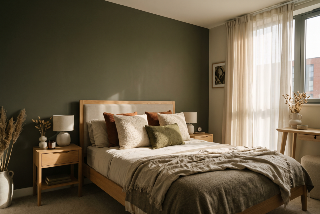
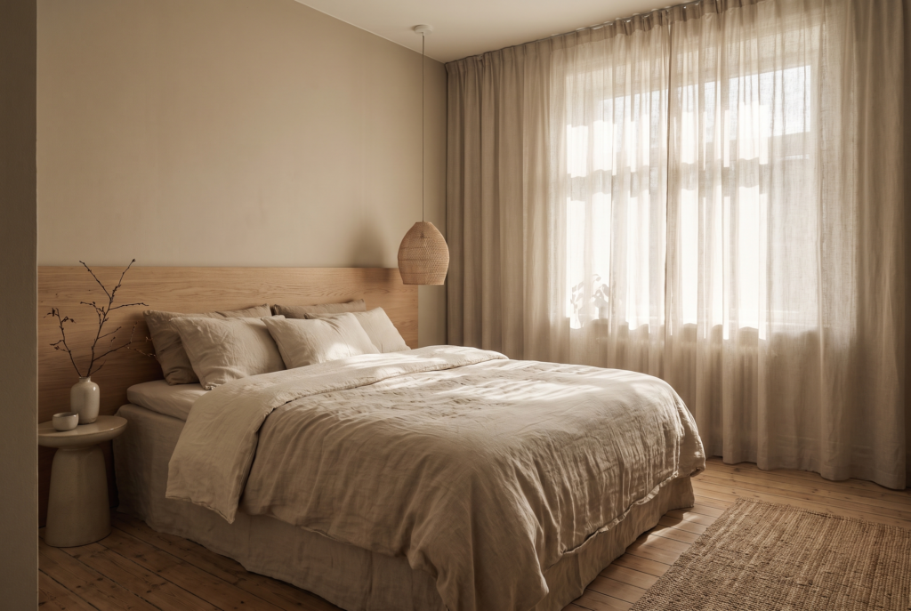
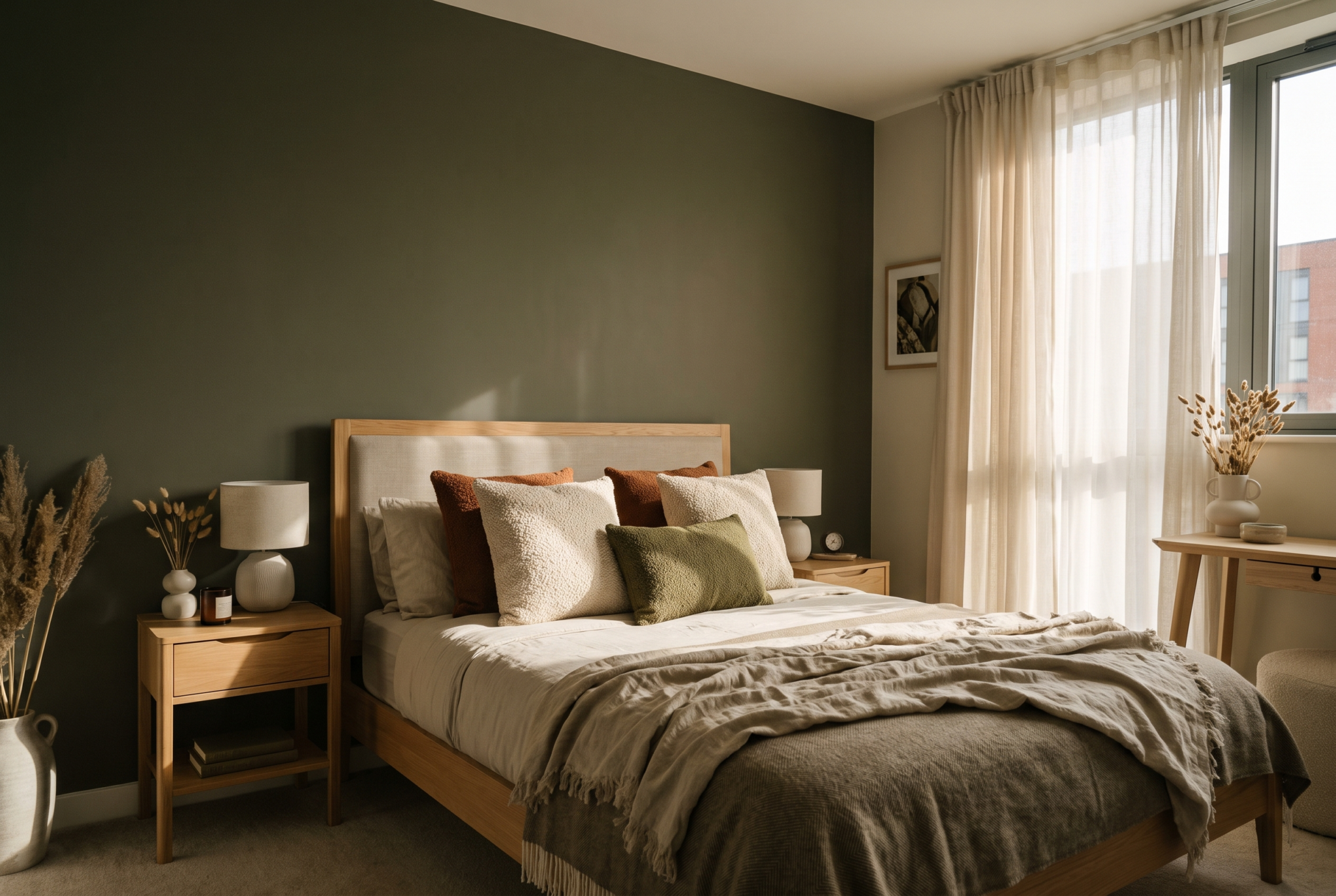
The commonest colour mistake in rentals is treating the whole property as one palette applied evenly. Each room has a different job, and colour is how you help it do that job. Bedrooms are for sleep, so they want tones that slow the heart rate: muted greens, soft blues, warm earthy neutrals, deep and enveloping rather than bright and stimulating. Living spaces can carry more warmth because they’re where people gather. Kitchens and bathrooms benefit from clean, fresh tones that read as hygienic, which matters here because these are the rooms guests scrutinise for cleanliness.
3. Colour changes the size of a room
This is where colour earns its keep in the compact city properties most short-term rentals actually are. Colour manipulates perceived space, and perceived space is what a guest is paying for. Light, cool tones recede, so they make a small room read as larger, which is why they’re the safe default for a tight studio. But the received wisdom that dark equals small is wrong. A deep, saturated colour can blur where the wall ends and make a small room feel intimate rather than cramped, especially in a windowless snug or a bedroom you want to feel like a cocoon. A pale room that feels bigger and a dark room that feels deliberate both work. A room that’s neither, magnolia because no one made a decision, just feels forgettable.
4. Colour is what makes your photos stop the scroll
Most of your colour decisions will be judged on a screen before anyone sets foot inside. A palette that looks fine in person can fall flat in a thumbnail, and a considered one can make a modest space punch far above its rate. Grey-on-grey-on-white is the reason so many listings vanish into the grid. A property with a confident colour moment, a deep green bedroom, a warm clay living room, a single rich accent wall, reads as considered the instant it loads, and that’s the difference between a guest stopping and a guest scrolling past.
5. Restraint is what separates considered from chaotic
None of this is an argument for a rainbow. The fastest way to make a property look amateur is too many colours competing, and it reads as noise on camera the same way it does in person. The reliable approach is a disciplined palette: two or three quiet tones that carry most of the space, then one or two considered colours that do the emotional work. A tight palette applied with confidence always outperforms a busy one applied nervously.
The test
Before you commit, ask what each colour in the property is actually doing. Is it setting a mood the property is meant to sell? Helping a room do its job? Making a small space feel bigger or more deliberate? Earning its place in the photos? If a colour isn’t doing one of those, it’s just there because a chart was open and a decision had to be made. Colour is the cheapest, highest-impact decision in the whole project. Paint costs little and changes everything, which means getting it wrong is expensive in the silent way, in the rate you can’t hold and the bookings that go elsewhere.
Treat colour as a tool with a job, not a finishing touch, and it does more for a property’s performance than almost anything else you’ll spend on. That’s what a single design decision can do when it’s actually taken seriously, rather than treated as an afterthought bolted on at the end. We apply that same scrutiny to every material, colour and layout choice across every Heim Studio project in Manchester city centre. Follow @heimstudiomcr or visit staging.heim-studio.co.uk for more, and if you want Heim Studio to design your space by becoming a HeimHost client, contact us today at hello@heimhost.co.uk or visit www.heimhost.co.uk.